
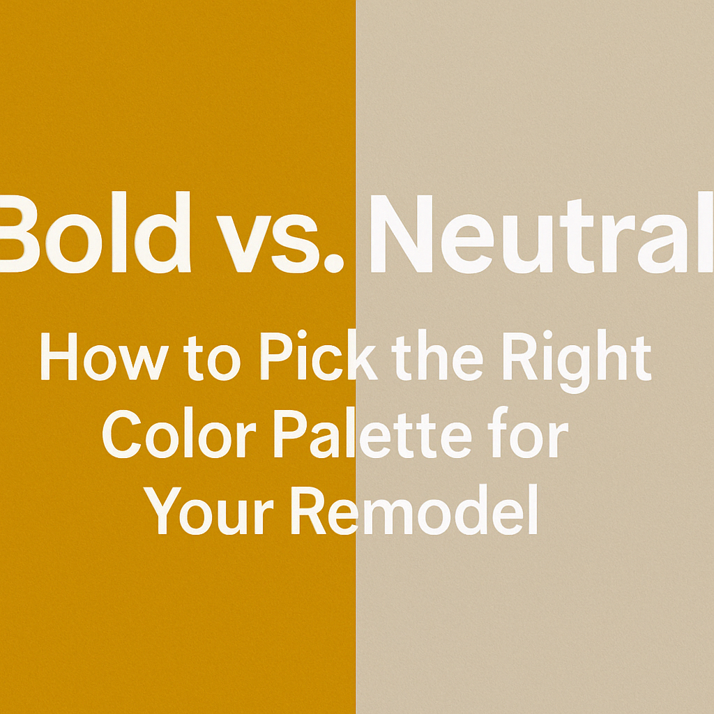
Bold vs. Neutral: How to Pick the Right Color Palette for Your Remodel
Introduction
Choosing the right color palette is one of the most exciting—and often most challenging—parts of remodeling your home. Do you go bold and vibrant or keep it calm and neutral? The answer isn’t just about style; it’s about how you want your home to feel, how light moves through your space, and how color complements your lifestyle here in Plantation, Florida.
At Fresh Remodel, we help homeowners design spaces that reflect who they are and how they live. Whether you’re aiming for drama or serenity, this guide will help you decide if bold or neutral colors are the right direction for your remodel—and how to strike the right balance between the two.
Why Neutral Colors Never Go Out of Style
Neutral color palettes—think soft whites, warm beiges, muted grays, and earthy taupes—are timeless for a reason. They offer versatility, sophistication, and a clean backdrop for almost any design. In a tropical climate like Plantation’s, they also help keep spaces feeling light, cool, and open year-round.
Neutrals are perfect if you want a home that feels calm, airy, and effortless. They reflect natural light beautifully and work well with natural materials like wood, stone, and linen. In smaller homes or rooms with less daylight, neutrals can also help open up the space and make it feel more expansive.
Best of all, neutral palettes give you flexibility to change your decor over time. You can always add pops of color through furniture, art, or textiles—and switch them out whenever you’re ready for a refresh without repainting the entire room.
The Power of Bold Colors in the Right Space
While neutrals are classic, bold colors make a statement. Deep blues, emerald greens, terracotta, black, and even jewel tones can bring life, energy, and personality into a space. When used thoughtfully, bold colors can highlight architectural features, define zones in open-concept layouts, or create a sense of drama in otherwise quiet rooms.
In homes across Plantation, bold colors are being used to reflect the vibrancy of South Florida. Accent walls in oceanic blue, statement islands in rich navy or forest green, or moody powder rooms in charcoal gray all add visual interest without overwhelming the design.
Bold doesn’t have to mean bright or trendy. A rich, dark palette can be elegant and grounding, especially when paired with metallic accents, natural textures, or layered lighting.
How to Know Which Palette Fits Your Lifestyle
Choosing between bold and neutral often comes down to how you want to feel in your home. If you crave calm, cohesion, and natural flow, neutrals may be your best match. If you love expression, contrast, and standout design moments, bold colors could be the way to go.
We also consider the layout of your space. Large, open-concept homes can handle deeper tones without feeling dark. In contrast, compact areas with limited light may benefit from a softer palette to avoid feeling closed-in.
Plantation homes with plenty of natural light are perfect candidates for either approach—you just have to decide whether you want that light to bounce around soft, creamy surfaces or enrich a deeper, more saturated palette.
Blending Bold and Neutral for a Balanced Look
The good news is—you don’t have to choose just one. Some of the most stylish homes combine neutral foundations with bold accents, creating balance and visual movement. A white kitchen with a navy island, a beige living room with a rust-colored accent chair, or a soft gray bedroom with a dramatic emerald headboard all demonstrate how the two palettes can coexist beautifully.
At Fresh Remodel, we often use color to define spaces by function. A neutral open living space might lead into a bold, cozy dining room. A neutral hallway may open up to a powder room painted in a rich jewel tone. The key is choosing a consistent undertone across your palette so the transition between spaces feels intentional.
Plantation’s Natural Palette Can Help Guide You
When in doubt, take inspiration from the colors already around you. Plantation’s natural surroundings offer endless design cues—from the sandy tones of coastal grasses to the deep greens of palm trees, the turquoise of nearby waters, and the sunset corals and oranges of South Florida skies. Whether you go bold or neutral, grounding your color choices in the local environment ensures your remodel feels connected to where you live.
Conclusion & Call to Action
Your color palette is one of the most personal elements of your remodel. It sets the mood, defines the energy of the space, and creates a visual story that ties your home together. Whether you’re drawn to soft, timeless neutrals or bold, expressive tones, the best choice is the one that reflects your lifestyle and feels like home.
At Fresh Remodel, we help homeowners in Plantation, FL make confident color decisions with expert guidance, curated palettes, and a deep understanding of how design works in South Florida’s light and climate.
Located in: Plantation Promenade
Address: 10089 Cleary Blvd, Plantation, FL 33324
Phone: (954) 933-4510
👉 Ready to find the perfect color story for your remodel? Contact Fresh Remodel today for a free consultation—and let’s create a home that feels as beautiful as it looks.


Leave a Reply